Meeting a rapid response brief with Xperience by Kentico.
As the hybrid work-from-home culture gathered pace, we, along with many, observed a decline in the full utilisation of our own meeting spaces. Identifying a promising opportunity, we resolved to open our doors to local creatives and businesses in search of a conducive venue to support their own flexible and face-to-face team collaboration.
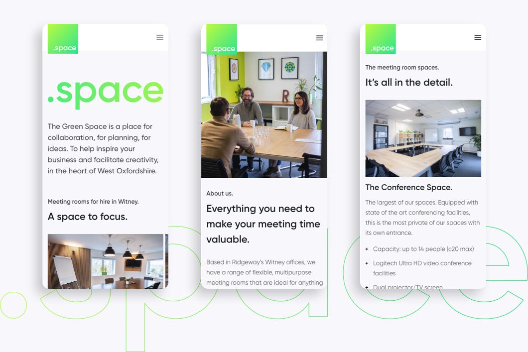
And thus, our full test drive with the new hybrid headless DXP, Xperience by Kentico commenced. Our goal was to create a stylish and impactful website, featuring our exquisite rooms, along with providing comprehensive service and location information, and simple instructions for reserving your own team space.

Acceleration
Several requirements were identified as crucial to the success of this initial project:
- Destination - Firstly, we wanted to get this site deployed and running as quickly as possible. Whilst we acknowledged that this was an opportunity to learn how to work with the new platform, we had to balance this against the need to get the site built and deliver value relatively quickly.
- Performance - The site had to be highly performant, and easy to use by the marketing team, whilst serving high-quality imagery, with a responsive image handler hooked up to Azure Blob Storage.
- SEO - We needed the site to rank well on search engines. SEO was a fundamental focus to ensure that we were the first to appear on Google within our locality.
- Features - We were keen to use out-of-the-box features as much as possible. We wanted to use Form Builder for our Contact Form, for example, and Page Builder to enable customisation through widgets.
Fuelled up and ready to go
We began by setting up a blank solution. In a previous first look blog post we’ve touched on the many benefits here of having templates available via the .NET command line interface. The development team love the new tooling and managed to get a base site solution in place within a matter of minutes.
After setting up our Storybook pattern library and working through some of the initial designs, we were ready to go.
Kentico Xperience 13 migration
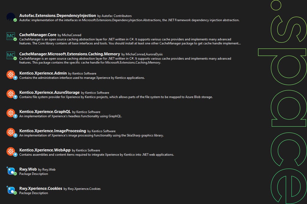
At Ridgeway, we like to componentise – we love reusability and so we bundle up much of our code and publish it as NuGet packages. The first challenge the team faced was migrating some of our existing core Kentico Xperience 13 packages over to Xperience by Kentico, which is based on a newer version of the .NET framework.
We really grasped this opportunity to begin afresh, going as far as to create an additional NuGet package feed, so that we could segregate our current packages from our new ones. This clean start gave us the opportunity to strip back our code and ensure that it only contained what we really needed. It was very liberating to be able to remove some of the bloat the code had gained over the years of developing various client sites.

The process of upgrading our NuGet packages was a breeze and the next step – migrating the Continuous Integration (CI) files included with these packages – also went smoothly. Having CI files embedded within our NuGet packages is a great way to promote code reusability and consistency. It also means that we can import our NuGet packages and have the embedded CI files drop into the site’s CI directory, ready to run.
Azure blob storage and media libraries
Prior to starting this project, our exploration of the available storage solution options supported by Xperience by Kentico was somewhat restricted. However, we were delighted to find out that our current plan for delivering high-quality, responsive images would remain unaffected, and no modifications were necessary.
Our media files are stored in Azure Blob Storage, and we utilised a separate .NET application to integrate with this store and to provide image-transformation functionality and file format support (including the WebP format), allowing the site to serve images appropriate to the client’s device.
Xperience by Kentico encourages the use of media libraries, specifically designed for files intended for public use. These libraries are perfect for images, videos, audio files, and more. However, they are not suitable for handling sensitive files, as their GUIDs (Globally Unique Identifiers) can make them easily accessible through a browser.

One of the main advantages of storing files in a media library is the seamless reusability across different pages, which is always beneficial. We have found the "Media Libraries" app within the CMS to be user-friendly and an excellent tool for organising our files.
Despite their name, media libraries can also accommodate non-media files, making them an efficient solution for sharing content between pages effortlessly. So, any type of file that you wish to share can be conveniently stored in a media library.
Navigation and content hub
In developing our new site, we utilised the all-new Content Hub to create navigation menu content items. The process of migrating the repository and business logic methods responsible for loading and rendering the menu required only minimal adjustments.
This seamless migration of existing functionality played a pivotal role in expediting the site's development from concept design to its successful launch in just under two weeks. Moreover, it provided the reassurance that we were leveraging well-tested and reliable code without the need to start from scratch.
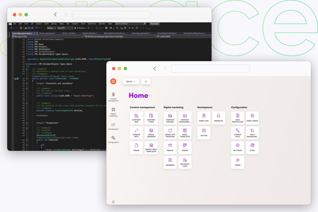
The Content Hub itself deserves special attention, as it really opened up a world of possibilities during our development process. It served as a convenient and centralised way to store and manage content that could be published across various channels. Alongside housing navigation items, the Content Hub also accommodated items utilised in accordions, carousels, and customer testimonials. Much like Media Libraries, Content Hubs prove to be very versatile repositories with countless practical applications.
Contact us
To create our Contact Us form, we opted for using the Form Builder, which offers a user-friendly graphical interface for effortless form creation. This tool also grants access to a set of pre-defined page elements, enabling quick and straightforward addition of items like emails, file uploads, reCAPTCHAs, and phone numbers. Furthermore, the Form Builder comes with built-in validation, streamlining the process and ensuring data accuracy.
Though our Contact Us form was relatively simple, we still experienced noticeable speed improvements, and the ease of use greatly enhanced our field setup and creation process.
Hotfix and tuning
The Kentico team released several hotfixes while we were on this journey. The process of applying these hotfixes is quite different from that for Kentico Xperience 13, in that upgrading the database is now a command-line instruction, but it’s smoother, faster, and just as reliable.
A few bends to consider
Part of the process of building the new site involved resolving references to features that we’d been accustomed to using in Kentico Xperience 13 which weren’t yet available. For us, the most notable of these was localisation.
When we build new solutions, we utilise the Kentico Xperience localisation features, which are fantastic aspects of the platform, whether or not your site has more than one culture. Our clients love being able to tweak the text in headers, labels, and other fixed elements from within the CMS, without having to raise a support request.
At the time of building our meeting space showcase, Xperience by Kentico’s localisation features were evolving on the roadmap and as this was a brand-new platform with lots of exciting new features, so we were happy to accept a little code debt, and just make a note of the things we’d have to come back to and update in the future.
Anticipating the future release of the full localisation options, we decided to initially localise our MVC views using .resx resource files. We don’t often use these, as they can’t be edited from within the CMS, but this approach did put in place a foundation that would make it easy for us to identify the strings we wanted to handle this way, allowing us to migrate them into the localisation app in the future.
Other than this, there was only one other teething problem we encountered but speedily resolved as per usual, helped by the Kentico Support Team who responded to our questions and offered great advice.
Deployment
The new deployment process was quick and straightforward. Unlike the previous approach of having separate deployments for the admin and public sites, Xperience by Kentico now combines them into a single entity. This consolidation brings evident advantages in terms of deployment simplicity and speed.
SEO enrichment
As a final step, our in-house SEO experts took advantage of the built-in metadata fields to add some search-engine-friendly descriptors to the site, to help satisfy one of the project’s key requirements.
Using Xperience by Kentico, and the rapid response, we quickly built a small but performant, SEO-rich content showcase for our meeting spaces – and have lots of great plans for it with the upcoming releases!
The future
Our new site is currently using Forms to provide a Contact Us mechanism, we’re hoping to now extend to include full integrated online booking, allowing users to reserve their space at any time, day, or night!
Xperience by Kentico offers support for continuous deployment (CD), a feature we were eager to explore but unfortunately lacked the time to investigate thoroughly. Our interest lay in utilising this feature to establish automated deployment through a pipeline. This approach would not only save time spent on manual deployments but also streamline the process of deploying content stored in the site's database too.
The short journey has been thoroughly enjoyable, and after our first full test drive with thegreenwork.space on the new Xperience by Kentico platform, we are excited to share that we are already making plans for several new exciting long-distance road trips!
